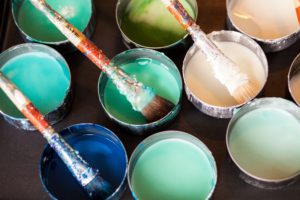
 When it”™s time to redecorate your workspace, there are some obvious choices you can make regarding paint colors. Many companies choose light, neutral tones to play it safe. And of course, colors that complement your corporate logo can be useful, as well.
Stepping outside of these hues can be a bit trickier. Neutral colors can blend in and go unnoticed without having a strong effect on the mood of your co-workers. However, there”™s a vast range of psychological reasons to consider other colors. The right color can theoretically enhance productivity, and the wrong color can have a strong, negative impact.
A Google search for “most productive color” will steer you toward blue, first. It is often cited as stable and calming, according to this article from Inc. It”™s traditional and generally well liked by most people, so it sounds perfect, right?
On the other hand, orange is considered to be “stimulating,” yellow is called “creative,” and red represents “high energy.” Those are all desirable effects at work too, aren”™t they?
The truth is, every single color has theories attached to it that suggest great psychological benefits as well as some cautionary tales warning against their use. So which hue is best? According to color psychologist Angela Wright, the supposed attributes for each color are an “oversimplification.” It”™s not so much the color as the intensity of the color that helps decide the reaction. “A strong bright color will stimulate, and a color with low saturation will soothe,” she explains.
The answer is probably somewhere in the middle of the spectrum. If blue is the color of productivity, as analysts seem to agree, then what shade of blue is perfect? Dark blue might be too dramatic and overbearing, whereas a pastel blue might feel weak and ineffective”¦and a bright sky blue may remind people of being outdoors. However, instead of daydreaming about being outside, such a color might simulate the effect of sitting in a park instead of a cubicle. A medium blue or aqua tone can also suggest water, which is generally accepted as relaxing and positive.
We mentioned incorporating the colors of your logo as a design element, but this can backfire if used incorrectly. Ask yourself: Did you choose your logo colors for the same reasons you will choose your wall color? Red and yellow supposedly elicit feelings of hunger, which is why they are popular for fast food logos. But hunger isn”™t the goal at most offices, so a heavy dose of those tones could be a mistake. Consider using them as accent colors to cultivate corporate pride, but look elsewhere for the main color scheme.
Ultimately, the key is to combine all of these theories to help determine the ideal colors for your workspace. Next time you are adding some color to your workplace, try to choose a pleasant, cheerful, but not too distracting palette to strike a balance that leads to a stimulated, yet focused environment.
Need a little assistance? Contact us for a consultation, we”™ll be happy to help you choose the best colors for your home or office.
