Boulder is home to an array of historic bungalows, whimsical Victorians, and mountain havens, each with distinctive personalities. Our bustling city has seen its fair share of house painting styles and interior design trends pass through, leaving their marks on Boulder”™s architecture. Certain color schemes from years”™ past can continue to add personality and beauty to the walls of a home while others can severely date a space. Here are some color pallets that will immediately date even the most modern of homes.
Dusty, Cabin-in-the-Woods Hues
Colors in the plaid, mustard, and brown families no doubt make a space look weathered, worn, and dusty. Interior designers used to believe that faux-wood paneling coupled with gray and forest hues could transform a simple, one-story ranch into a cozy cabin. However, elements of this aesthetic now make a home appear cluttered, small, and cramped. Pairing shades in the grayish-green family with dark brown, faux-material and plaid will make a space appear more like an outdated clubhouse or cabin in need of a makeover.
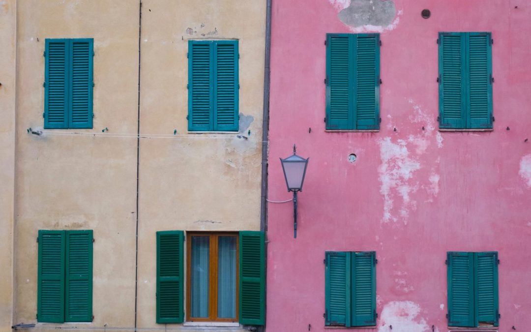
Faux-Tuscan
Paint colors from this decorating genre include light tans, sandy yellows, off-whites, and muted browns. The color pallet strives to resemble that of an Italian country-side villa, faded from the bright sun with colors subtle enough to harmonize with ropy olive tree trunks or dark green vineyards. However, this scheme is stuck in the late 90”™s and early 2000”™s and will no doubt make your home feel left behind, as well.
Jewel Tones
When used as accent colors, jewel tones like emerald, ruby, or sapphire can make furnishings, backsplashes, or cabinets pop. When paired together, they have the tendency to make a space seem more like a museum exhibit than an entry way. The eye-catching tones are warm, engaging, and overt, yet can easily take center stage. While these colors were very popular in the 90”™s, they work better today as highlights for an understated aesthetic.
Avocado and Burnt Sienna
In direct response to the pastel, sugary-sweet color schemes of the 50Ӫs, this color pallet combo sought to invite nature inside the home. These colors are still popular, especially for the retro and vintage aesthetics. However, they should be left alone when it comes to wall paint colors. These are obvious mainstays of a 60Ӫs d̩cor style and can make kitchens and bathrooms look outdated and in need of a remodel.
Pepto Pink and Periwinkle Blue
Nothing screams remodel quite like a bubble-gum pink toilet or periwinkle blue tile. These colors are extremely reminiscent of decades gone and immediately signal that a home is outdated. However, coupling these colors with a slate gray paint color can give them room to breathe and make them look more modern. Chrome accents, natural wood furniture, and beige fabrics can tone down a Pepto-Bismol pink.
A high-quality paint job has transformative powers for the interior and exterior of any type of home. Our professional Boulder painters have years of experience and we even offer a free color consultation so you can confidently pair your perfect paint color with that avocado-colored refrigerator. 😉 If you desire to bring your Boulder home into the 21st century, or if you are simply in need of a top-rated, exterior house painting service, give us a call today.